Whether you own a brick and mortar store or sell completely online, chances are you’ve heard of Email Marketing. If you already have one in place, good for you. If you haven’t, you’re missing out on a lot of sales.
Email marketing is more than just increasing your sales, it’s about promoting your brand, building relationships and maintaining them.
In this two-part series, I’ll try to cover all the things that will take your emails to the next level. I’m not saying this is the right and only way. These are best practices based on my experience for the past 5+ years of designing emails. You can read the second part here.
Behavioural, Inaugural and Transactional Emails
There are a lot of different types of marketing emails. Behavioural, inaugural and transactional emails are some of the most common emails you should be sending to your prospects and existing customers.
Each type has a specific purpose and trigger. It only follows that they’re designed and presented differently, but don’t stray too far. Notice how while Casper has different styles, it keeps the same header and footer for most of its emails below? They have no-menu style for behavioural emails like asking for reviews.
Casper from Really Good Emails
Is it time to say Goodbye to “The Fold”?
You’ve probably heard of “The Fold”. In traditional forms of media such as newspapers this refers to the upper half of the front page. Since papers are often displayed folded, customers can only see the top. They have to make a decision whether to pick up the paper and read further based on it.
Overs the years, online marketers have been debating whether “The Fold” is important in email marketing or not. We have a lot of screen sizes through which we read our emails after all. Based on experience, “The Fold” is still very important and a premium space.
First impression last, as they say, but it’s important to not be a stickler for rules; No one wants to see the same email over and over again.
Always aim for delivering your message across straight as soon as they open your email. And, if you can’t, “entice them to scroll down“.
Take a look at dreem’s email below. Instead of having a hero image on top to deliver the message, they went for clear and big texts with a CTA and added a lifestyle image to support the message.
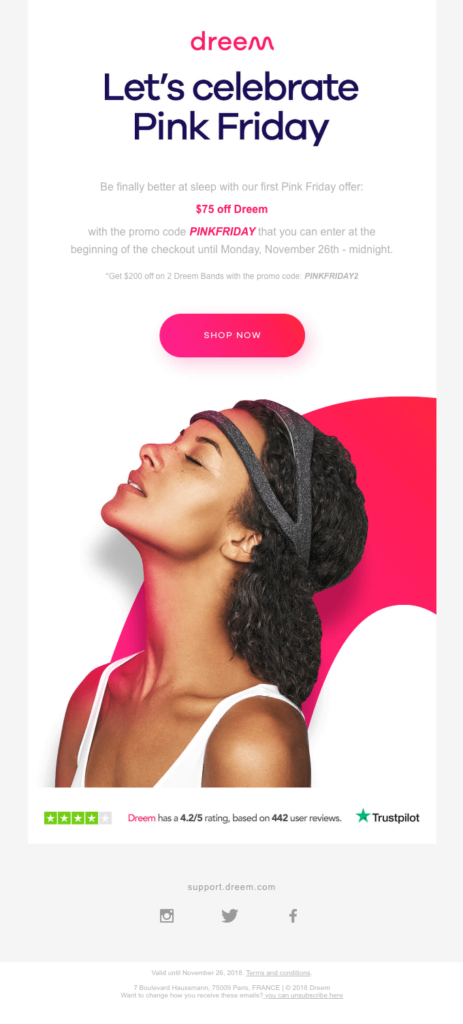
Dreem from Really Good Emails
Keep things visually appetizing and easy to digest
Create an information hierarchy. Layout your email in a way that it helps the viewer know what they should look at first. Your email’s main purpose should always be your main content and anything to support that purpose should follow it. Try the Inverted Pyramid or Zig-Zag framework and use a single column layout, almost always. It’s good to have a good mixture of these layouts so as not to make your emails…boring.
Adobe and Apple from Really Good Emails
Do pictures really paint a thousand words?
If your recipients have images turned off, what will they see? Your images should complement the email; it should not be the message. Use lifestyle images of your happy customers and your products in use. And be careful when using stock photos, keep your images on brand and genuine.
No one wants blurry images so double the normal dimensions of your images to around 1,200 pixels. Save your images at 72ppi/dpi and optimize it for web. Save your images as JPG and PNG files. And only use GIFs mainly for animations and only if they aren’t too big.
Adweek and Headspace from Really Good Emails
Don’t forget your image alt text! It’s important so readers can read what your images are about if their email clients do not display them. And never ever use images for call to action buttons. If your image has text on it, write the overlaying text as the alt text. This way if the image doesn’t load, the text will still be read.
Balance your content and have more text than images — 60:40 is a good balance.
In general, be creative with your emails while remaining consistent. Design for humans and imagine how you will receive the email yourself. Take your potential customer into a journey that will benefit both you and them.
In the next series, I’ll talk about fonts, colors and spaces!
Pingback: Taking Your Email Design Seriously Pt.2 - Kenna